
Always read the numbers behind a graph because sometimes the best intentions can make for one skewed visual. Recently, when I was meandering through the publishing blogs, I came across an article by Charlene Brusso, arguing that women authors are underrepresented in Science Fiction–or, as people prone to brevity call it, SF–citing how women authors have consistently written fewer than fifteen of SF’s top 100 titles since 2004. It makes for some impressively depressing figures.
The numbers look dire for women authors. But how bad are they? To tell, I would need to know if women actually published that much SF. I didn’t find that information, but I did find this article from Strange Horizons. And I noticed something odd about the bottom line for Locus Books.
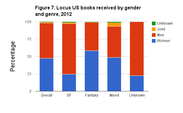
Huh. That’s odd: The overall numbers on the far left aren’t actually that bad, as men and women are only a few percent off (which would be a bad thing in light of Brusso’s numbers) but then again, maybe it’s not so bad, as women are easily the minority in the SF chart. But then why does the chart overall—all five bars—have noticeably more red than blue? In fact, just eyeballing the figures I come to the conclusion that chart as a whole is about 65% red, a fair bit off from the 55% figure the overall bar gives us when taken alone. Ah, we’ll come back to that. Moving on to the UK figures.
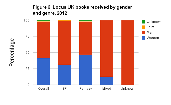
Whoa! There is no doubt something’s going on here. The overall figures are notably uneven, but it’s still about a 35-65 split, but summing up all five bars again, less than 25% of the graph overall represents women. The overall visual impression the graph leaves you with is about 10% misleading.
So what’s going on here? The answer is in the numbers. The overall bar for the UK represented 363 authors, while the Unknown bar represented only one. That one author commands over a fifth of the overall coloration of the graph, despite representing only one book of more than three hundred and fifty. The same thing is true with the American graph, albeit to a lesser extent, as the Unknown bar there represents only nine books and authors. Meanwhile the (many) women who publish in the fantasy subgenre are, again, underrepresented in the graph because fantasy is the largest subgenre in both markets.
Is this malicious manipulation? Almost certainly not. Percentile comparisons are easily the best way to compare the representation, and subgenre is also a great way to classify that representation. It’s just when visually displayed like this the combination winds up exaggerating matters.
So what does this mean for sexism in publishing? I really can’t tell you. The original article I linked to is mostly about review and top sales slots specifically in SF, and when you draw a circle around SF on these graphs it becomes obvious women are under-represented there. On the other hand, as women have a commanding majority within American Fantasy, it could be that there’s just less interest by women in SF. I just don’t know. This is just a reminder to always be skeptical of information, especially if you’re inclined to agree with it.